Cookie PRO — designing pro-grade crypto analytics, from sketch to production code
Problem
Turn Cookie's huge, dense dataset into a pro analytics surface for two audiences at once — analysts who need fast depth, and enterprises sizing up Cookie as a data provider — all while the direction kept moving.
Solution
A layered architecture (insights first, raw data on demand), pro-grade filtering on Cookie's social data, and a visual language that broke from the consumer products. When Figma-to-handoff became the bottleneck, I built the production frontend directly in code.
Outcome
A full analytics surface, built end-to-end from sketch to vibe-coded frontend — proving out a layered approach to dense data and a code-first process that solved the design-to-build lag.
What Cookie is
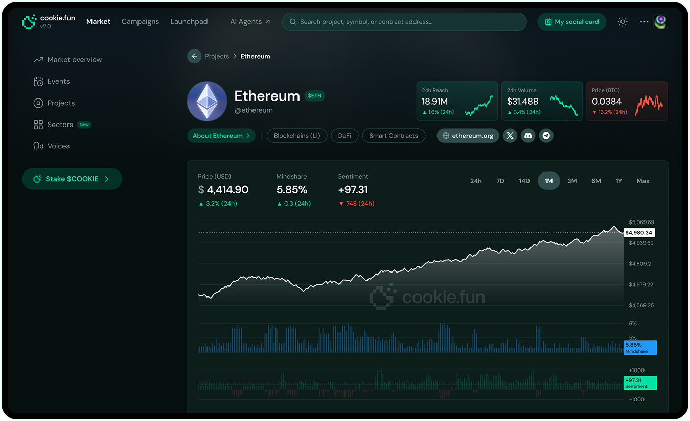
Cookie is a crypto data infrastructure company — sentiment and mindshare (our custom metrics), on-chain activity, who actually has social influence. The analytics layer for crypto.
That data fed four products:
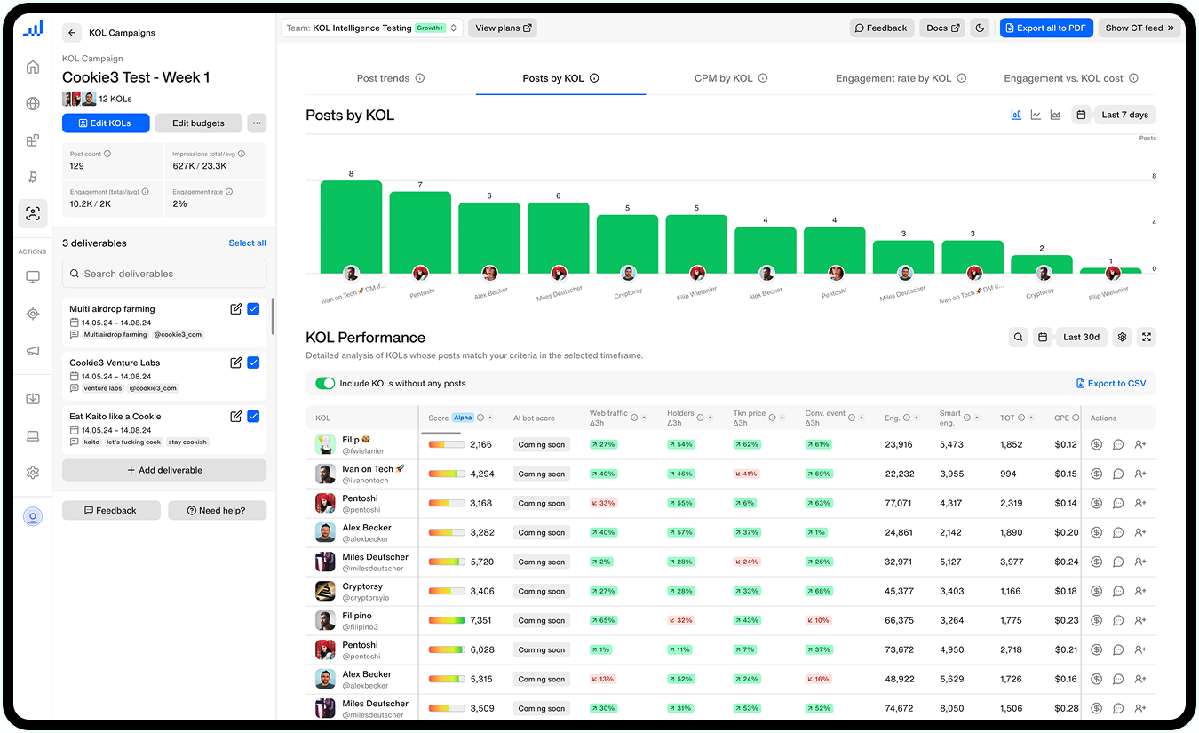
- Cookie3 Analytics — social and blockchain analytics suite for enterprise crypto marketers
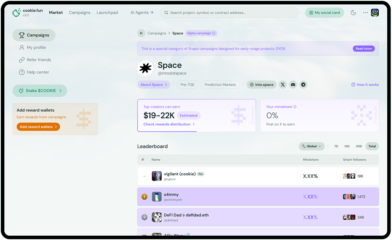
- cookie.fun — consumer-facing tracker for retail traders to spot trends and attention shifts
- Cookie Snaps — social marketing campaign platform connecting brands with content creators (the company's biggest revenue stream)
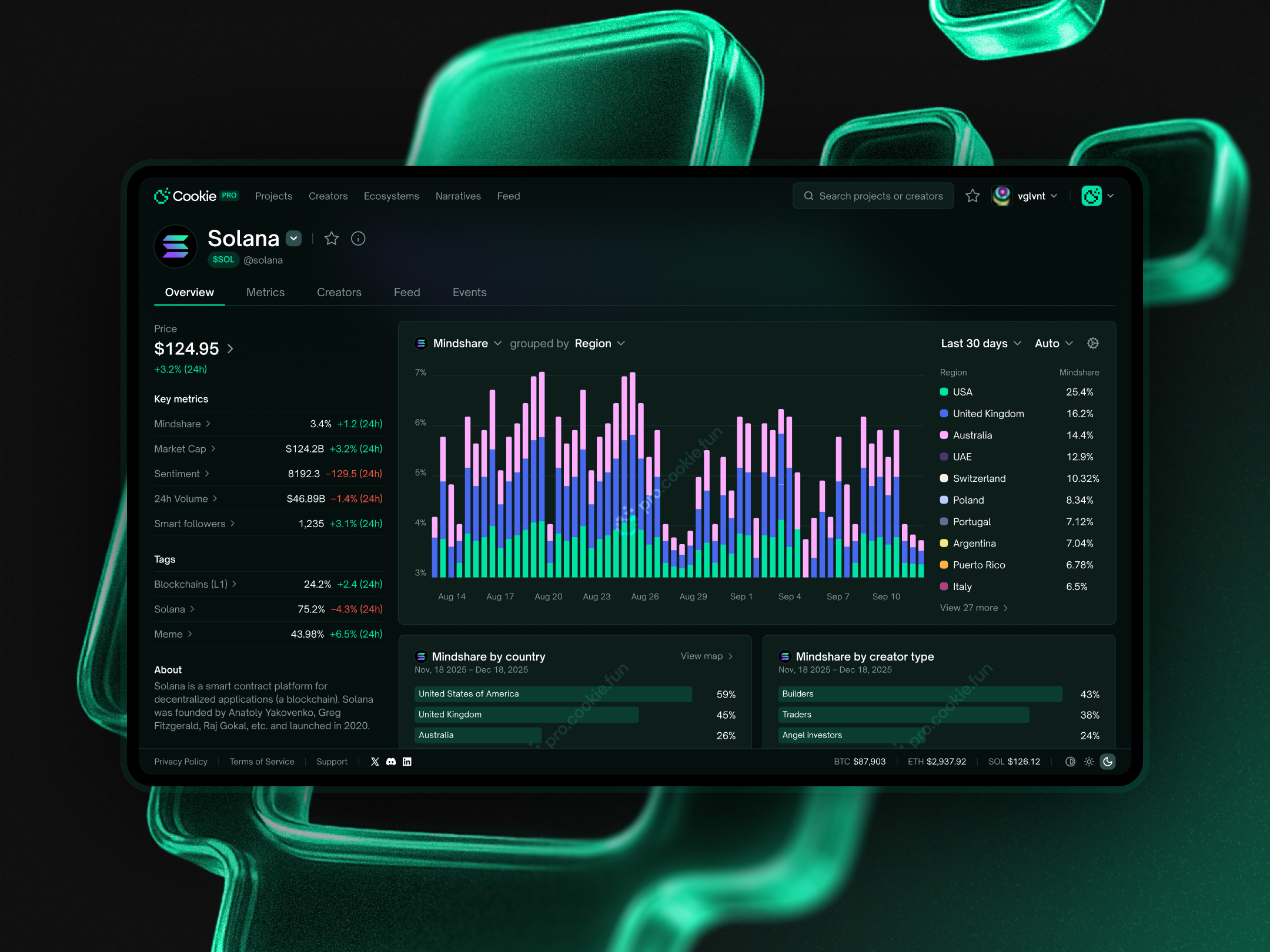
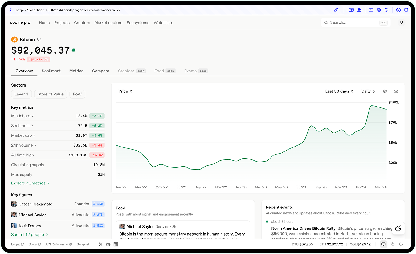
- Cookie PRO — the "serious" layer, for funds and researchers who want depth, not a dumbed-down retail view
By far, Cookie PRO was the hardest, and the one that best shows how I work.
The real problem: depth without drowning
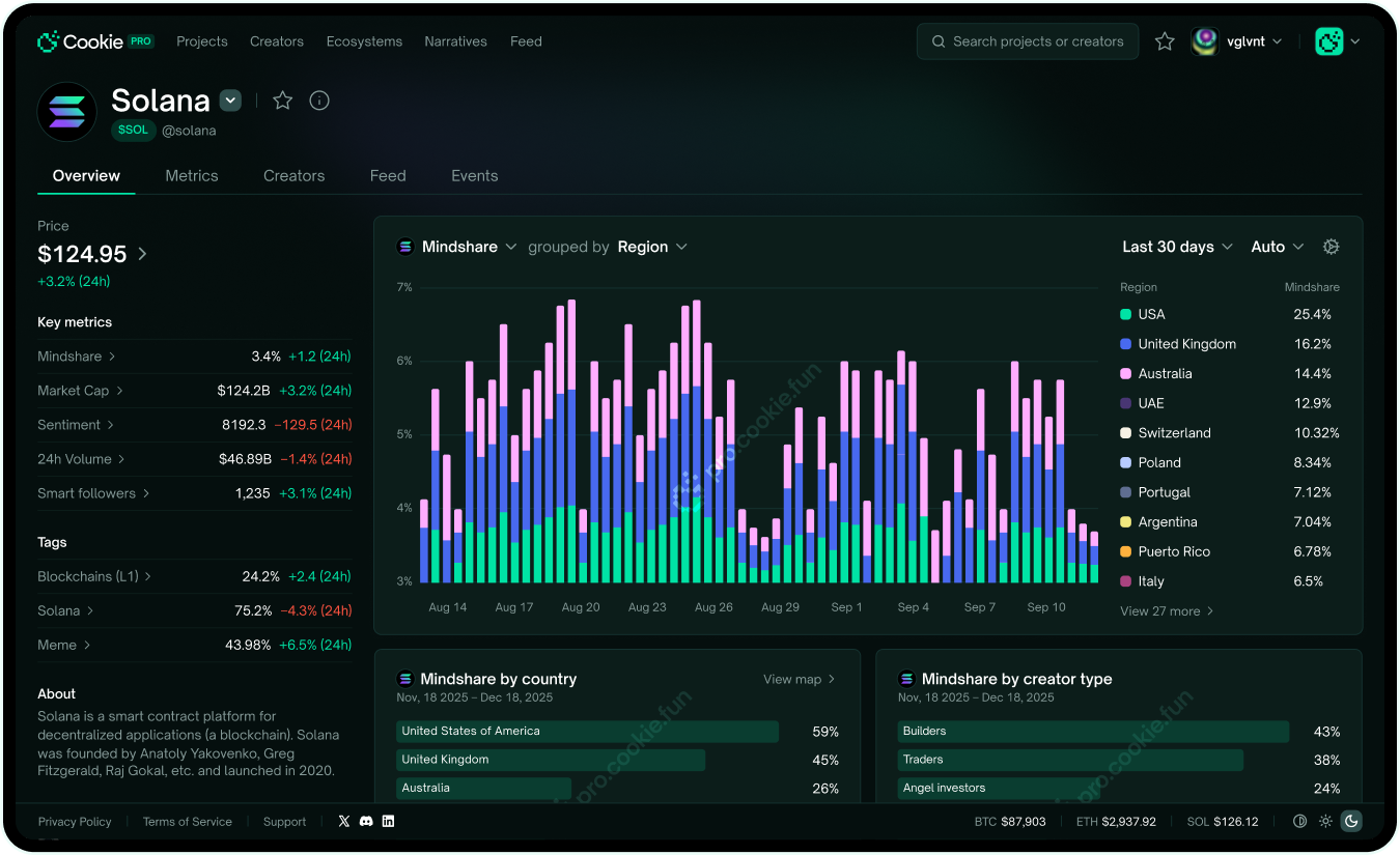
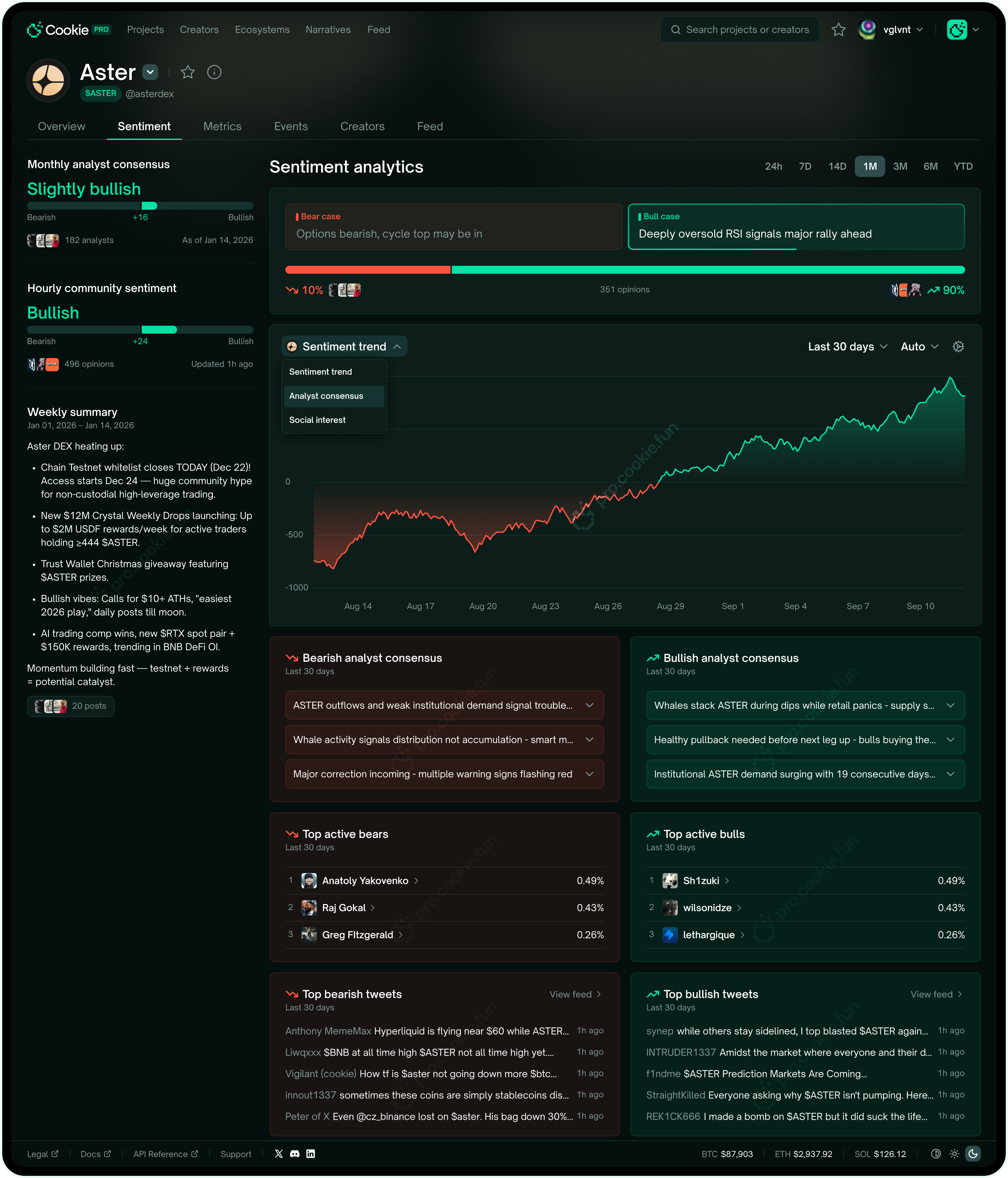
Raw data is useless on its own. Pro users want the insight, but also the raw numbers a click away the second they need to check. The hard part wasn't having the data — it was showing all of it without burying the person looking at it.
There was a second job too: PRO had to make Cookie look like a serious data provider. Every screen was half product, half sales pitch — look how much crypto-native data we have, and how usable it is. That tension drove the business model: tiered pricing, free tier as the way in. Everything had to land for the working analyst AND the enterprise deciding whether to buy.
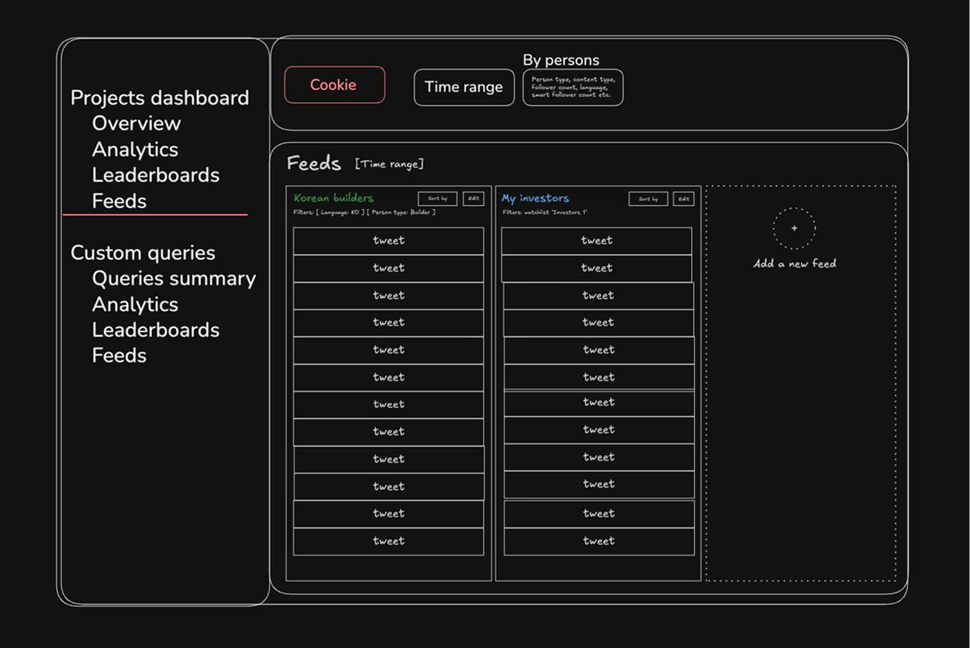
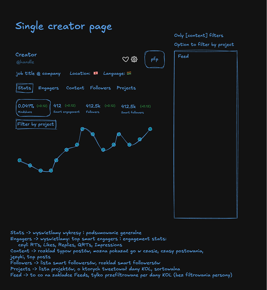
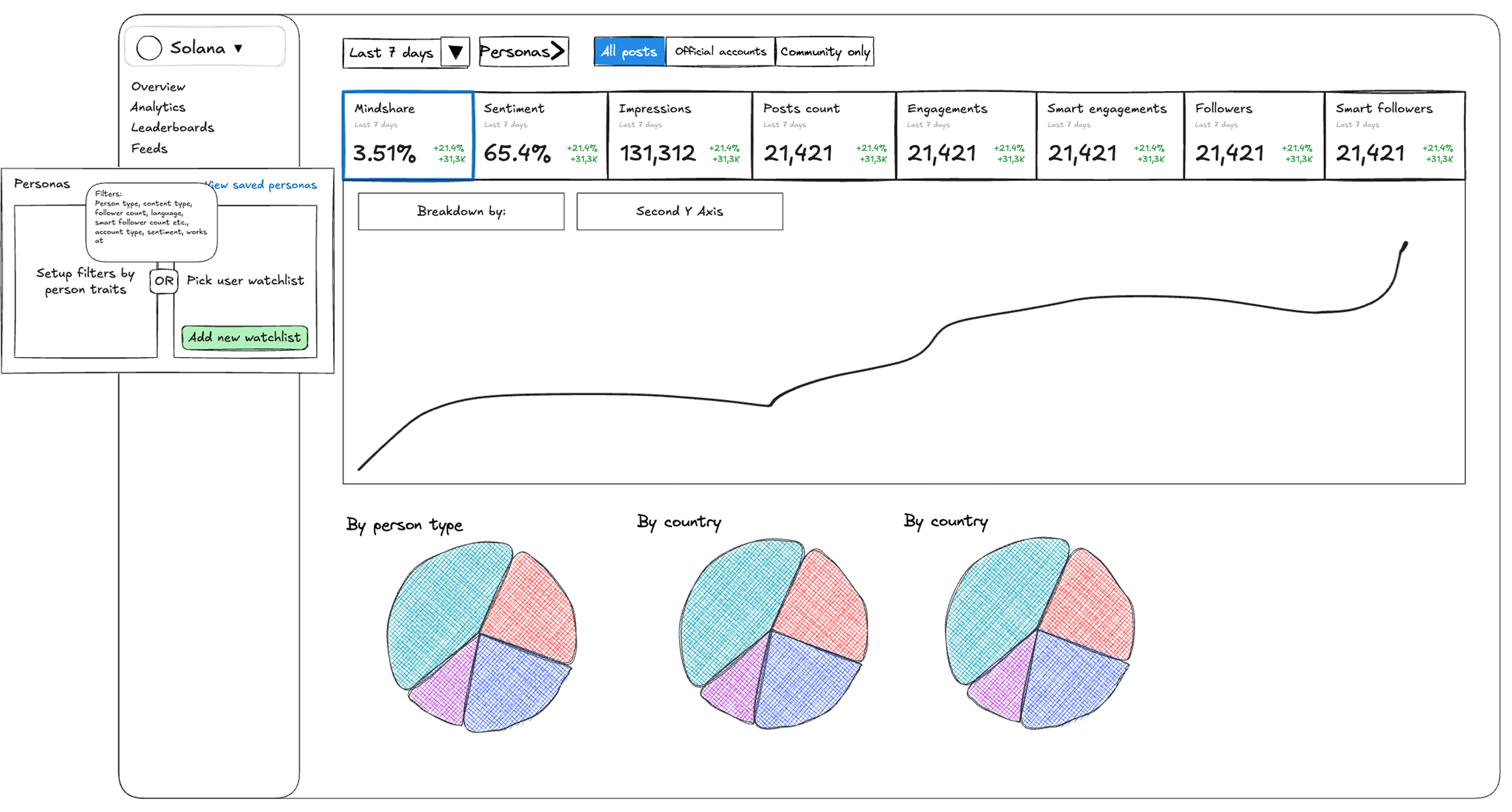
How I work: sketch → Figma → code
I sketch in Excalidraw first — what goes on each page, what the person's trying to decide. That's where the decisions happen; Figma just makes them real. I skip low-fi wireframes on purpose: with a system to lean on, I jump from sketch straight to high-fidelity, then push it to feel pro.
V1 — the inherited approach
The first version borrowed cookie.fun's design system. Path of least resistance — I built most of it on what we already had.
Technically fine. But the moment I saw it running as a rough frontend, the problem jumped out: it carried the same weight as cookie.fun, so it felt consumer-grade — exactly wrong for a product that needed to feel pro. Different audience, different language, even inside the same family.
V2 — a professional direction
I looked hard at the tools pros actually use — Coinglass, Token Terminal. Their filtering, density, and layout patterns mapped neatly onto what we needed.
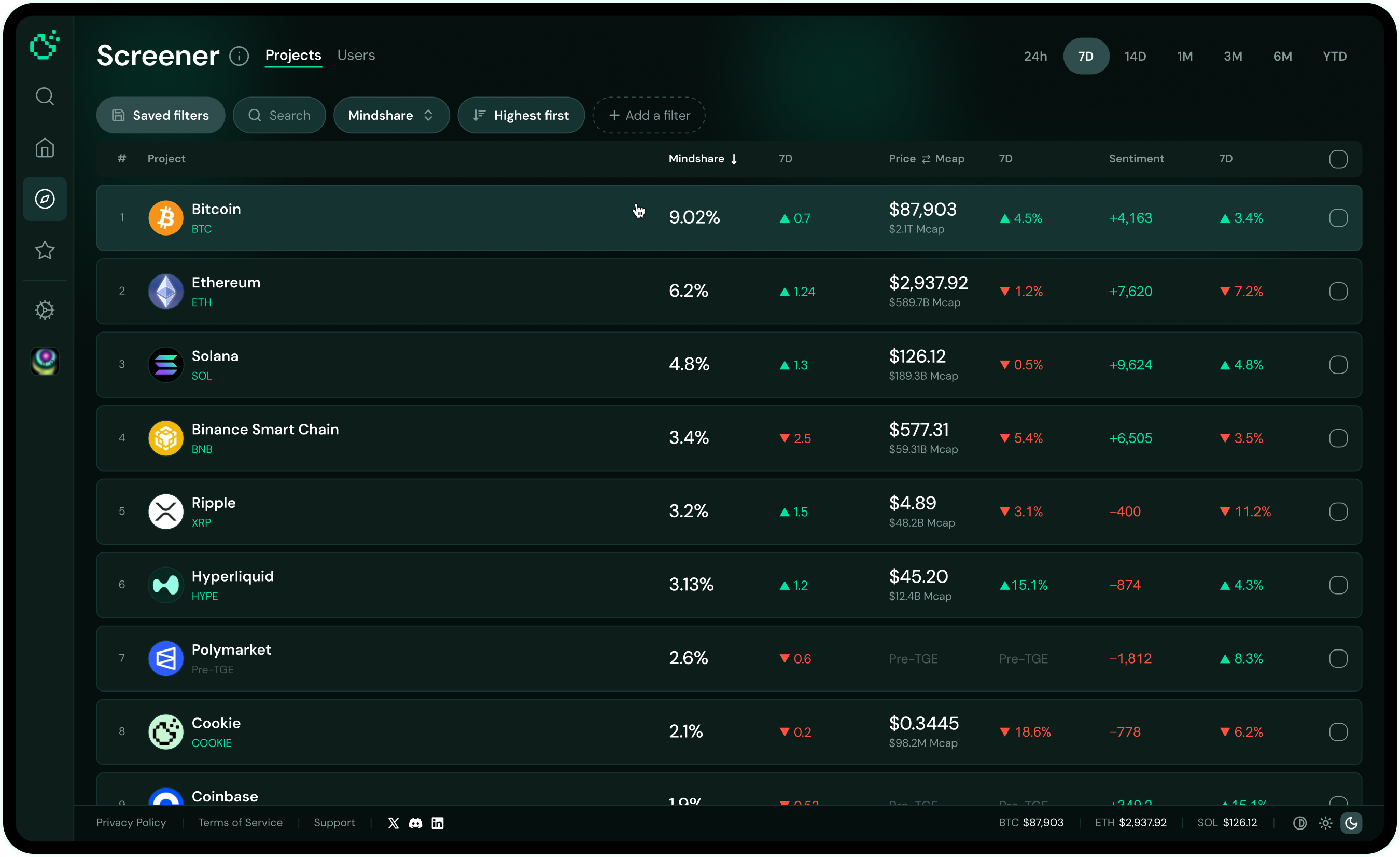
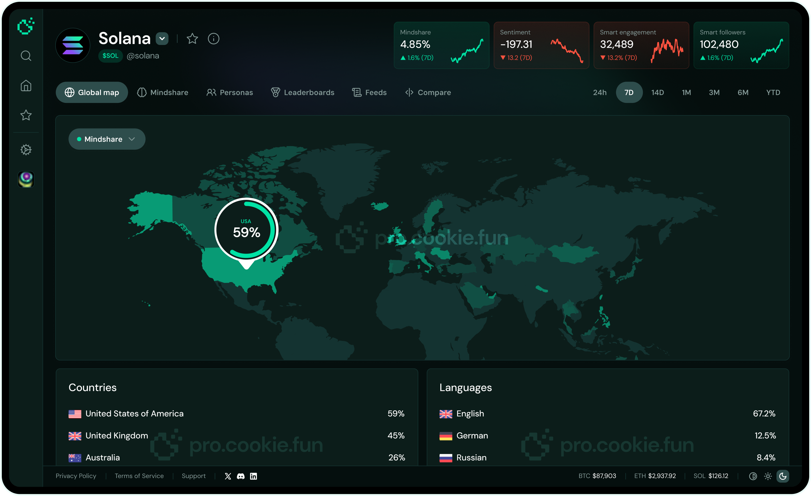
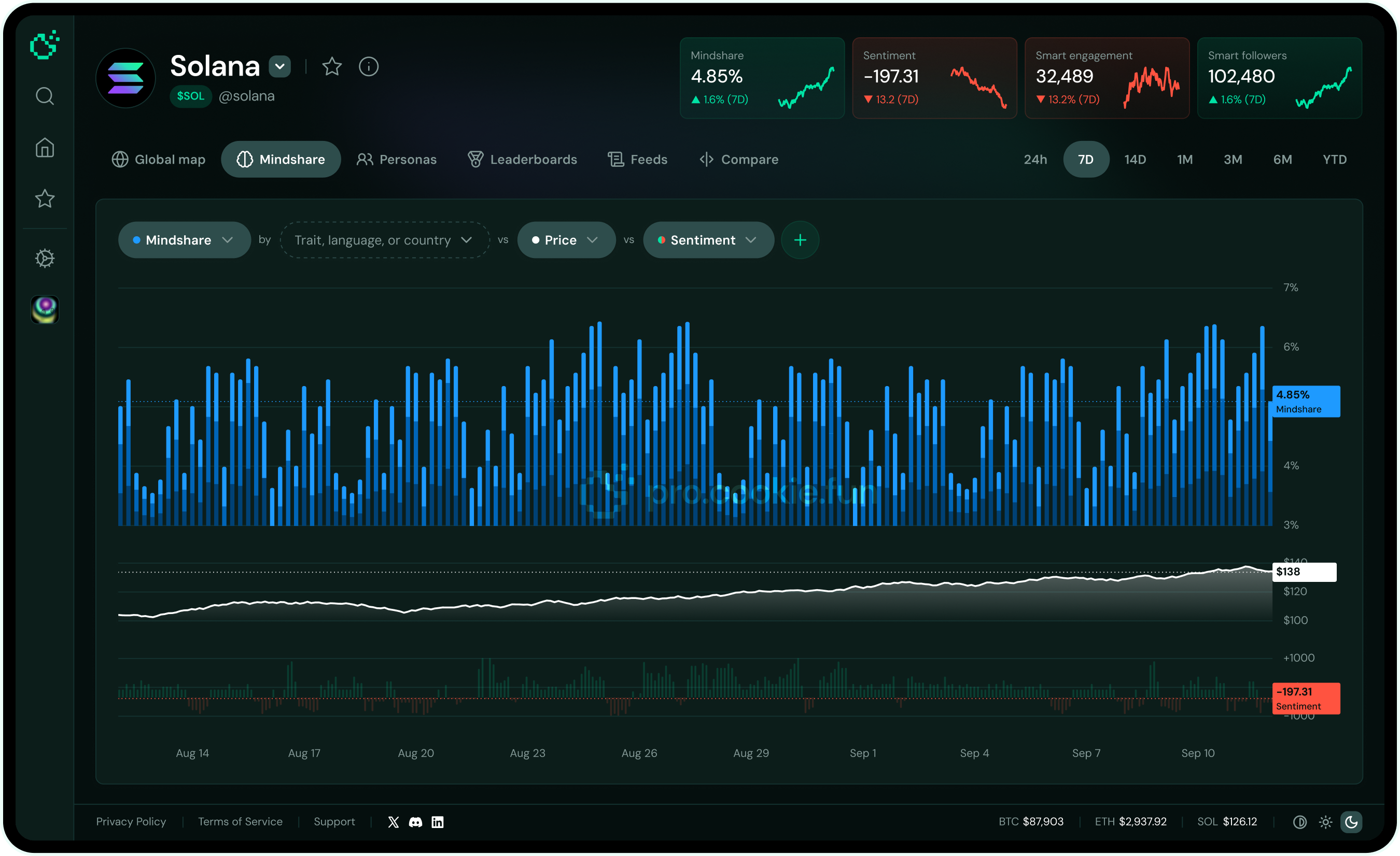
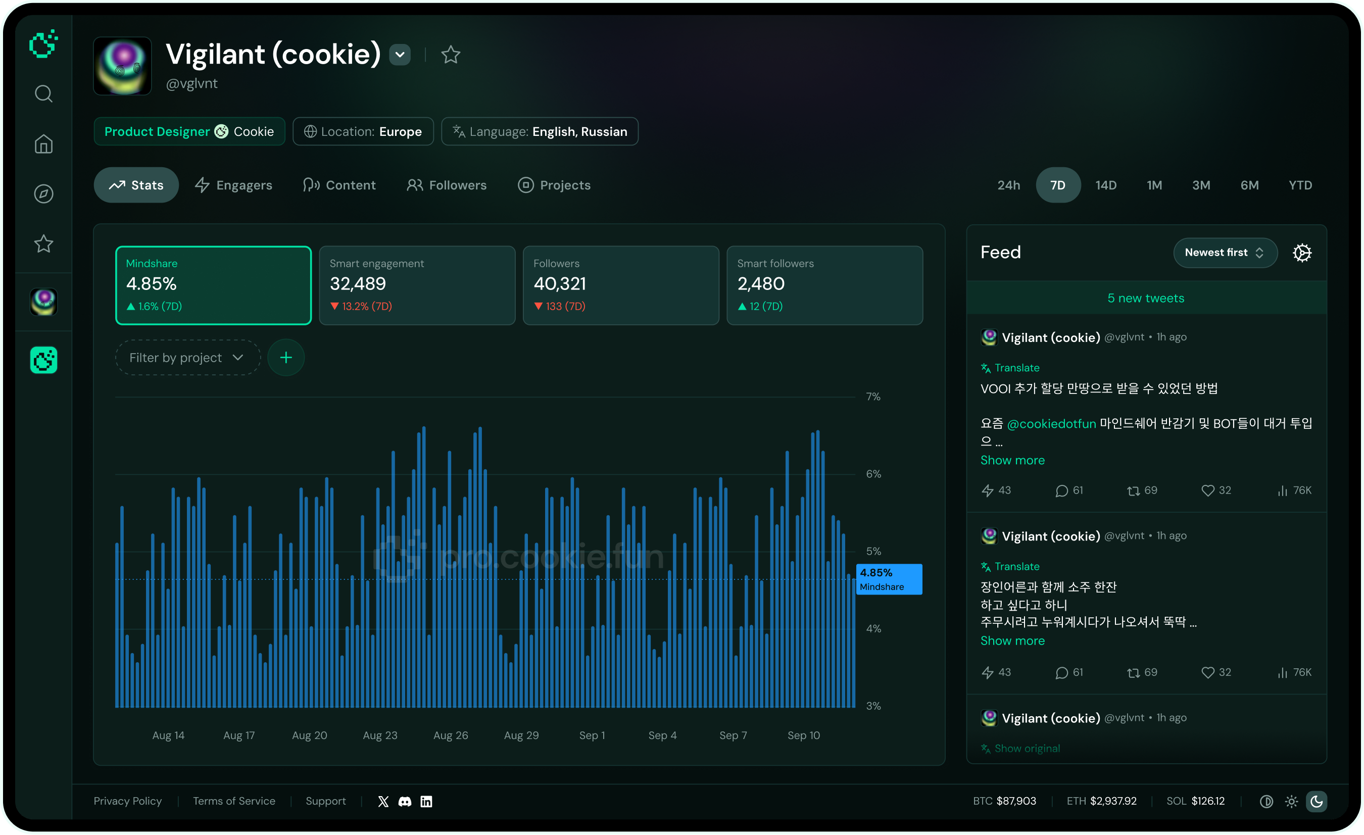
The big call was a layered architecture: curated insights up top, raw data in drawers and expansions. Pro users don't want a wall of data the second they land — they want what helps them decide first, everything else a click away.

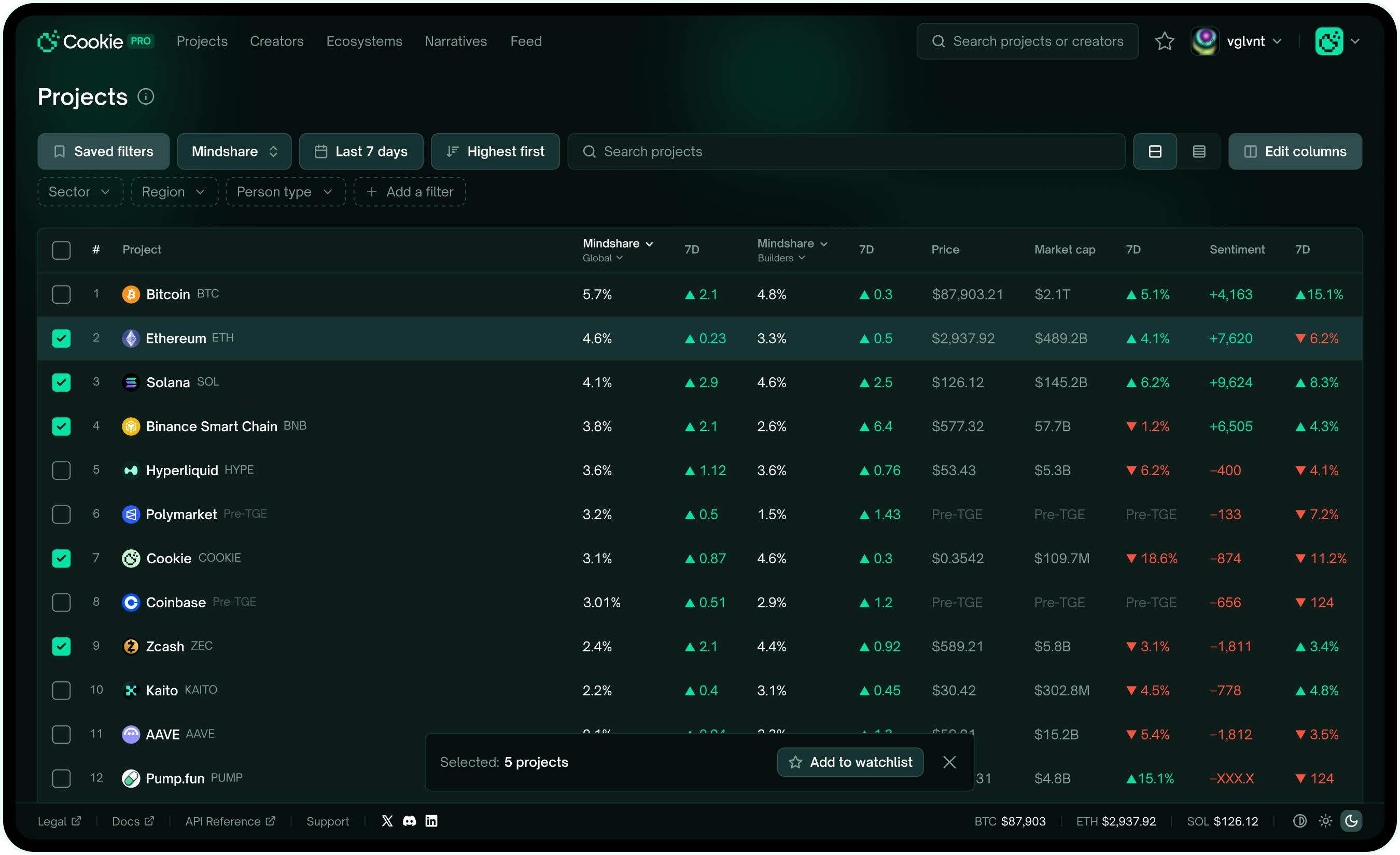
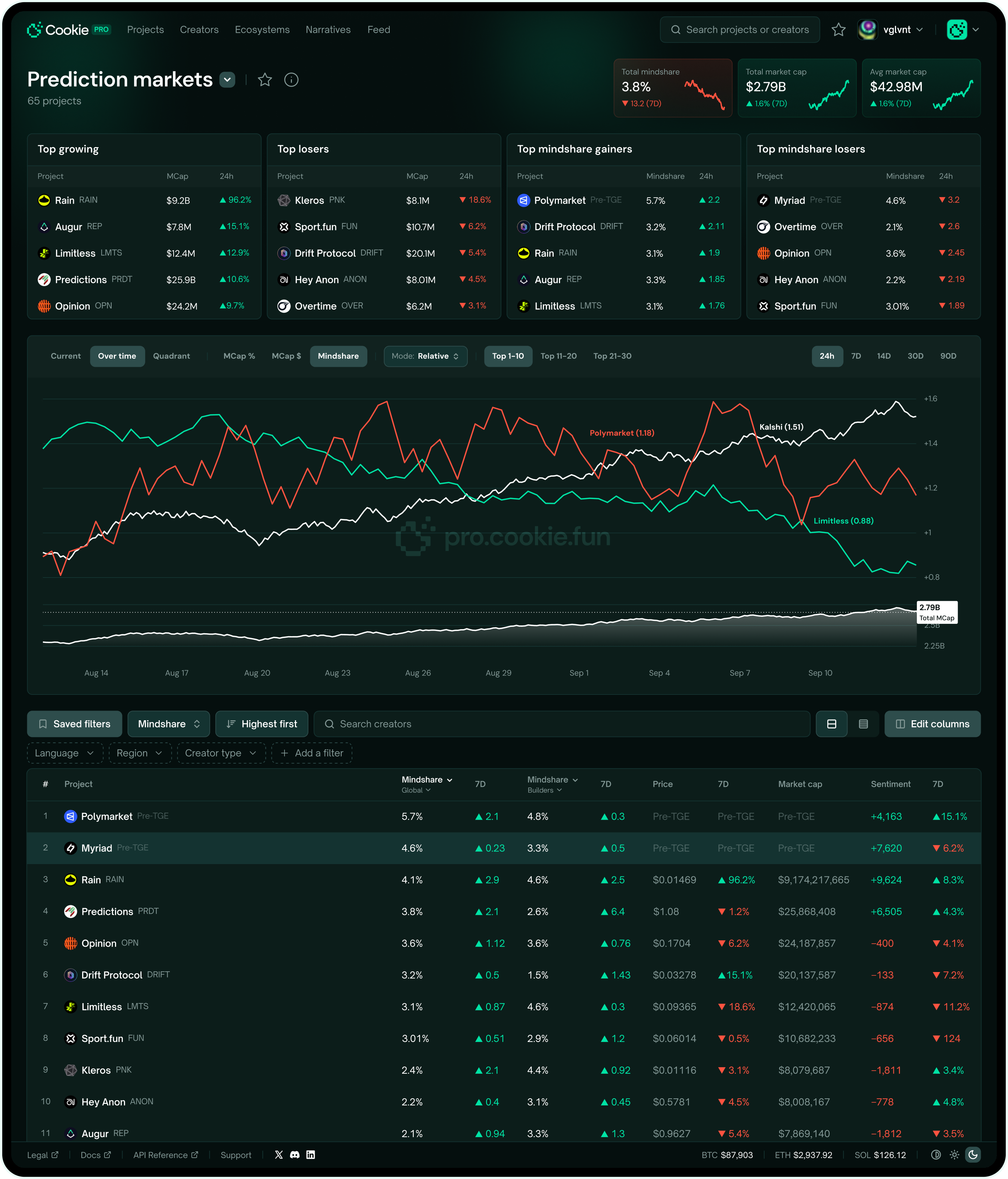
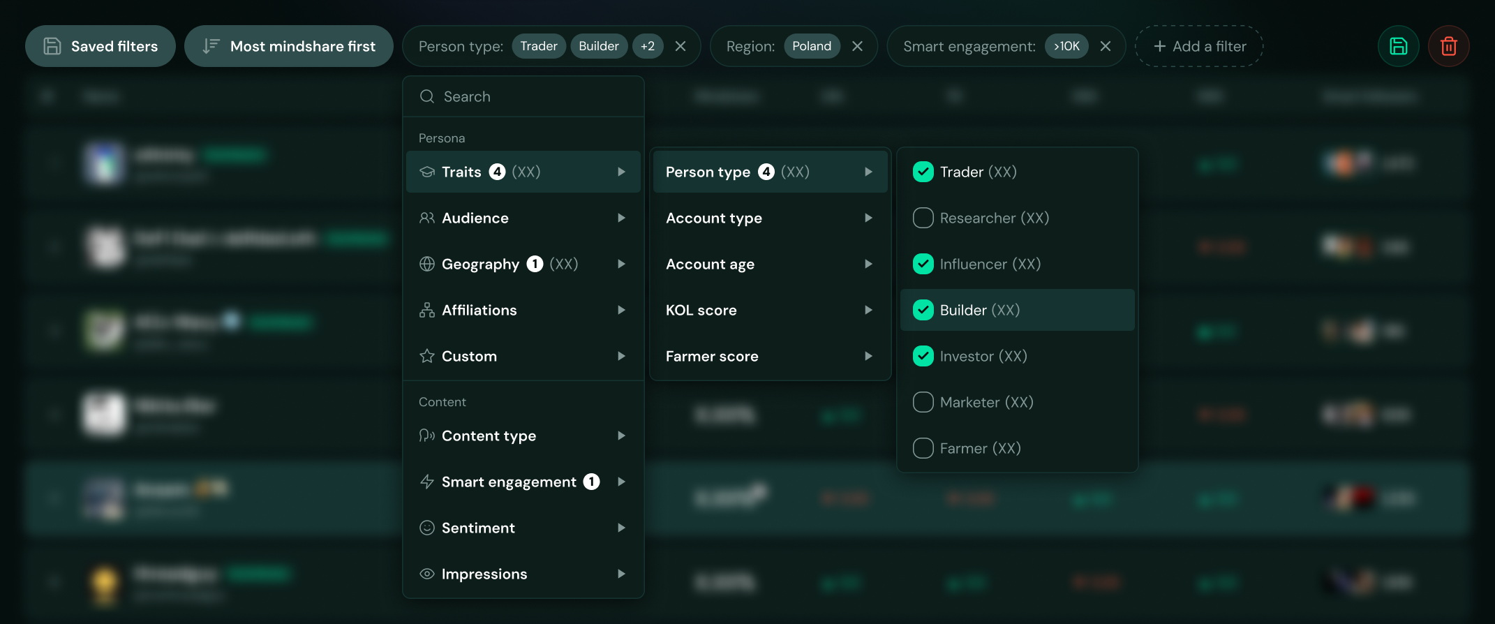
Advanced filtering
This is where the Token Terminal influence went deepest — pro filtering built around our data: personas, audience, geography, watchlists. Depth a retail product never needs.
Same filter set on every page, on purpose — Cookie's social data applies to anything: any project, sector, narrative. You can carve out a feed of just the tweets that matter. "Builders from Poland talking about this project." Who are they? What else are they into? That's where the real insight lives.
X was never built for crypto. So I built the layer that makes its data useful for it.
The vibe coding pivot
After V2, speed was the problem. Design in Figma, hand off, get back a brittle frontend, redo it — brutal when the direction keeps shifting. So I started building straight in code with Claude Code. The engineer took data and plumbing; I took the UI — components, layouts, the feel. The friction vanished, and I could finally tune motion and state directly, the stuff Figma can't fake.
The honest catch: only works if the designer can actually code. For me it killed the biggest bottleneck in the process.
Working dashboard demo available on a call.
Reflection
Cookie PRO taught me where Figma wins and where code wins. Not my first time using AI tools, but the first time I built a real product surface with code as the main medium. And the answer's messier than the takes you usually hear.
Once the vision's roughly there, code beats mock-and-hand-off — interactions and real data behavior show up faster than any mockup loop. But early, when things are vague, code's too slow; that's Figma's moment.
The trap I avoid is forcing one tool to do everything. Ship and feel, instead of design and theorize — and remember that AI can build faster, but it's still just one step in the whole process.

Tim was our Lead Product Designer at Cookie, where he played a key role in translating complex, data-heavy product concepts into clean, intuitive user experiences. He combines strong UX thinking with sharp UI execution and real ownership over product outcomes. I can confidently recommend him to any team building serious, high-impact products.Read detailed reference